
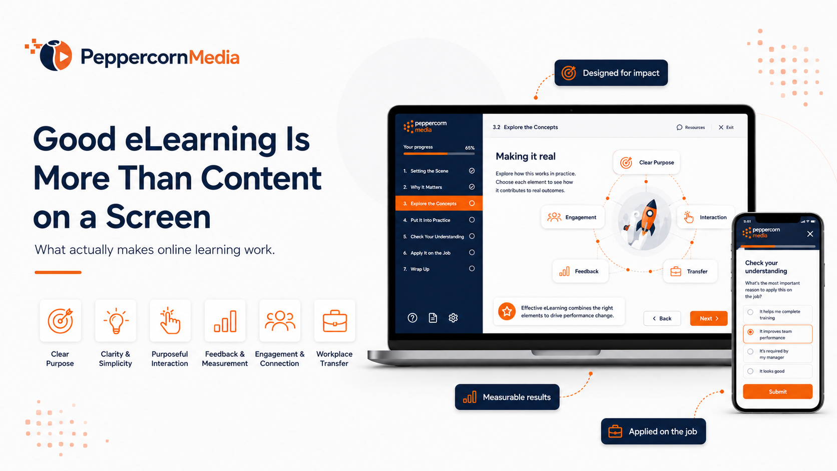
Effective eLearning design is not simply about putting content on a screen.
For more than 20 years, I’ve worked in and around training organisations. In that time, I’ve seen online learning done exceptionally well. I’ve also seen it done badly.
And, to be completely honest, I’ve made enough mistakes myself to know that good eLearning does not happen just because we upload a PDF, convert a PowerPoint, or add a quiz at the end.
Effectiive eLearning design should help someone understand something, apply something, make a decision, or perform a task more confidently.
At its best, eLearning manages attention. It reduces unnecessary mental effort. It gives learners opportunities to practise decisions. Most importantly, it helps them transfer what they have learnt back into the workplace.
That is where the real value sits.
The problem with “just putting it online”
One of the most common mistakes organisations make is assuming that existing content can simply be moved online.
There may already be a learner guide, a PowerPoint deck, a procedure, a policy, or a compliance document. So the thinking often becomes:
“We already have the content. Let’s just put it online.”
On the surface, that sounds reasonable. But it misses an important point.
A document is usually designed to be read. A classroom presentation is usually designed to be delivered by a trainer. A procedure is usually designed to be followed or referenced.
eLearning has to do something different.
It has to guide the learner when the trainer is not there.
Without a trainer present, there is no one to explain the tricky part, notice confusion, provide a better example on the fly, or answer the question, “But what does that actually mean?”
That means the design has to do more of the teaching.
Content is not the same as instruction
This is where the distinction between content and instruction becomes critical.
Content says, “Here is the information.”
Instruction says, “Here is how to understand it, apply it, practise it, and know whether you are getting it right.”
That is a very different design problem.
The real question is not, “How do we get this content online?”
A better question is:
What does the learner need to understand, practise, decide, or apply by the end of this module?
That one question changes the whole design.
1. Start with performance, not content
The first principle of effective eLearning design is to start with performance, not content.
Most training projects begin with content. There is usually a folder full of documents, slides, policies, procedures, videos, assessment questions, and notes from different people across the business.
The temptation is to work through that material from top to bottom and turn each section into a screen.
That approach often creates passive learning.
The learner clicks through information, answers a few basic questions, reaches the end, and technically completes the course. But nothing much has changed.
A better starting point is to ask:
What should this person be able to do after completing this module?
Not just what should they know.
What should they be able to do?
Define what competent performance looks like
For example, if the topic is privacy awareness, the outcome is not simply, “The learner understands privacy.” That is too vague.
A stronger outcome might be:
“The learner can recognise when personal information is being handled, identify a possible privacy risk, and choose the correct action before sharing that information.”
Now there is something useful to design around.
You can show the learner a realistic workplace situation. Perhaps you could ask what they would do, and you might provide options. You can explain or demonstrate the consequences. You can show what good practice looks like.
That is much stronger than simply saying, “Personal information must be handled in accordance with privacy requirements.”
Before building anything, ask:
What does competence look like in the real world?
That becomes the anchor for the learning design.
Once you know what competent performance looks like, you can make better decisions about what to include, what to leave out, what to practise, and what to provide as a reference.
2. Triage the content before you build
Most eLearning projects do not suffer from too little content. They suffer from too much of it.
When organisations already have a lot of material, there is often pressure to include everything.
Every policy, slide, paragraph, table, appendix and “just in case they need to know it” detail gets pushed into the course.
Before long, the eLearning module becomes a content dumping ground.
A useful way to avoid this is to triage the content before you build.
Sort the material into three categories:
- What must the learner understand or do during the course?
- What is useful background, but does not need to be heavily taught?
- What should simply be available as a reference after the course?
That simple exercise can dramatically improve an eLearning module.
Teach what matters and reference the rest
Not everything belongs in the main learning experience.
Some information needs to be taught, some needs to be practised, some needs to be checked, and some simply needs to be available later.
For example, a workplace policy might be 30 pages long. The eLearning module does not need to narrate the entire policy.
Instead, it might explain the key responsibilities, show realistic workplace situations, ask the learner to make decisions, and provide the full policy as a downloadable reference.
That is a much better use of the learner’s time.
Good eLearning is not about cramming everything in. It is about making deliberate choices.
3. Reduce cognitive load
Cognitive load refers to the amount of mental effort someone is using at one time.
In eLearning, this matters.
If the screen is crowded, the wording is dense, the visual does not match the explanation, and the learner has to work out what matters, their brain is spending energy on the wrong things.
They are not thinking, “What does this mean, and how do I apply it?”
Instead, they are thinking, “Where am I supposed to look?”, “What is the important bit?”, “Why is there so much text?”, and “How long is this going to take?”
Effective eLearning design reduces unnecessary mental effort.
It uses clear layouts, plain language, relevant visuals, and sensible sequencing so the learner can focus on the actual learning, not on decoding the course.
This does not mean dumbing things down. It means respecting how people learn.
Use a clear learning rhythm
When someone is new to a topic, they are not just collecting information. They are trying to build a mental model. They need to understand what is relevant, how ideas connect, and what they actually need to remember.
If we throw too much at them at once, they might technically see the information, but they probably will not absorb it.
A useful learning rhythm is:
Context. Explanation. Example. Activity. Feedback.
First, give the learner the context. Help them understand why the topic matters, where it fits, and why they should pay attention.
Then explain the key idea.
After that, show an example so the idea becomes more concrete.
Next, ask them to do something with it, even if the activity is simple.
Finally, provide feedback that helps them check their understanding and improve.
That rhythm is far more effective than simply stacking information on screen after screen and hoping the right bits stick.
A useful test is this:
If someone had no background in this topic, would this screen still make sense?
If not, something needs attention. The explanation may need to be clearer. The example may need to be more realistic. The visual may need to do more work. Or the whole section may be in the wrong order.
Good eLearning should feel guided, structured and purposeful. It should not feel like the learner has been dropped into the middle of a pile of information and left to work it out alone.
4. Use visuals to explain, not decorate
Visuals matter in eLearning, but they need to earn their place.
A lot of online courses include images because the screen looks empty without them. So a smiling person with a laptop appears. Or a stock photo of a meeting room. Or someone pointing at a whiteboard with unnatural enthusiasm.
There is nothing wrong with making a course look polished. But visuals should support the learning.
A good visual should help the learner understand something faster, remember something better, or see something that would be hard to explain through text alone.
Make the visual do some teaching
If you are teaching manual handling, a simple visual showing good and poor lifting technique is more useful than a generic photo of someone holding a box.
When the topic is suspicious emails, an annotated screenshot is more useful than a stock image of a padlock.
For a customer complaints process, a clear flowchart may be better than three paragraphs of text.
The question is:
Does this visual help teach the point that needs to be made?
If the answer is yes, use it.
If the answer is no, it may just be decoration.
Decoration is not always bad. A course still needs to look professional. But decoration should support the learning experience, not distract from it.
The best eLearning visuals are not always the flashiest. They are the clearest.
5. Add interaction with purpose
Interaction is one of the most misunderstood parts of eLearning.
Interaction does not mean making learners click things just because the software allows it.
Most of us have seen courses where the learner has to click every tab, icon, card, marker and random object on the screen just to reveal information that could have been shown clearly in the first place.
That is not always meaningful interaction.
Sometimes it is just hide and seek.
Good interaction should do more than reveal content. It should make the learner think.
It might ask them to make a decision, identify a risk, choose the best response, compare two options, apply a rule, or respond to a realistic workplace situation.
That is where effective eLearning design can become much more powerful than passive content.
Move beyond clicking
Interaction does not have to be complicated. A simple activity can be very effective if it has a clear learning purpose.
At a basic level, you might ask the learner to recognise something:
“Which of these emails looks suspicious?”
At the next level, you might ask them to choose between possible actions:
“What should you do next?”
At a stronger level, you might ask them to respond to a realistic workplace situation where the answer is not immediately obvious.
That is when interaction becomes more than clicking.
It gives the learner a chance to apply something they have just learnt, rather than simply recognise it on a screen.
This matters because the goal is not for the learner to remember the answer until the final quiz. The goal is for them to recall it later, when they are back at work facing the real situation.
Feedback is where the teaching happens
For example, instead of simply saying, “Always report workplace hazards to your supervisor,” you could show a situation where someone notices a spill near a busy walkway and ask:
“What should you do next?”
Then provide three realistic options.
One might be the best response. Another might be partly correct but incomplete. A third might be a common mistake.
Now the learner has to make a judgement.
The feedback is where the real teaching happens.
Do not just say “Correct” or “Incorrect.”
Explain why.
For example:
“That is the safest option because it controls the immediate risk and ensures the issue is reported through the correct process.”
Or:
“That response may seem reasonable, but it leaves the hazard in place and relies on someone else noticing the problem.”
That kind of feedback helps learners build judgement, not just memory.
One of the real strengths of eLearning is that it can let people practise decisions before they have to make them in the real world.
6. Design for transfer
The final principle is to design for transfer.
By transfer, I mean this:
Can the learner take what they have learnt in the module and use it back at work?
That’s the point.
Not just completing the course, not just passing the quiz. Not just clicking through the screens.
The real question is:
After completing this module, is the learner more likely to behave differently back at work?
If the answer is no, we may have created information, but we probably have not created effective learning.
Apply the workplace transfer test
Not every module has to transform someone’s life. But it should improve their ability to recognise something, decide something, avoid a mistake, follow a process, or complete a task.
After a privacy module, the learner should be more likely to pause before sharing personal information.
After a cyber security module, they should be more likely to question a suspicious email.
Following a workplace safety module, they should be more likely to recognise a hazard and do something about it.
After customer service training, they should be more confident handling a difficult conversation.
That is the transfer test.
Can they use it when the course is over?
Ultimately, that is where the value is.
The value is in whether the learning helps someone do something better, safer, more confidently or more consistently in the real world.
Where technology fits in effective eLearning design
The tools available now are genuinely impressive.
We can build interactive modules in tools like Articulate Storyline and Articulate Rise. And we can use LMS platforms to track enrolments, progress, completions and reporting. We can create screen recordings, simulations, branching scenarios, video tutorials, AI-assisted narration, images, animations and knowledge checks.
All of that can be useful.
But technology does not fix poor design.
A boring course does not become effective just because it has animation. A confusing course does not become clear just because it has narration. A weak assessment does not become meaningful just because it is online.
The foundations still matter:
Clear outcomes. Content triage. Reduced cognitive load. Relevant visuals. Purposeful interaction. Useful feedback. Transfer back to the workplace.
Technology should support the learning design. It should not be used to disguise the absence of one.
What makes effective eLearning design work?
Good eLearning comes back to a few core principles:
Start with performance, not content.
Triage the content before you build.
Reduce cognitive load.
Use visuals to explain, not decorate.
Add interaction with purpose.
Design for transfer back to the workplace.
If you get those things right, your eLearning is already ahead of a lot of what is out there.
It does not need to be overproduced or full of gimmicks. It does not need to be complicated for the sake of looking impressive.
But it does need to be designed.
Good eLearning is not just content on a screen.
It is a learning experience built to help someone understand, apply, practise, decide and transfer that learning into the real world.
That is the difference.
At PeppercornMedia, effective eLearning design means turning existing training content into clear, structured and practical online learning that learners can actually use.
If you need support turning existing training materials into online learning, PeppercornMedia’s eLearning development services can help. You can also view practical examples of online learning and course design, or contact PeppercornMedia to discuss a project.